OUGD 401 - Study Task 3

'The Uncle Sam Range' (1876) Advertising Image by Schumacher & Ettlinger, New York

Poster by Savile Lumley (1915)
Despite being created almost 40 years apart, these two
images share many similarities; both being designs aimed at men that depict the
aspirational lifestyle which ultimately forces a sense of patriotism upon the
audience.
The first image is an advertising image for ‘The Uncle Sam
Range’ designed in 1876 by Schumacher & Ettlinger. To me this is a very
nationalistic image that utilises pride in order to persuade people to buy
their product. Not so subtle imagery such as the overwhelming American colour
scheme in conjunction with a bombarding use of stars and stripes is a clear
indication that this poster is designed for America to boast to the rest of the
world. However, there are also many more subtle visual links to America throughout
the image such as the eagle sitting on Uncle Sam’s shoulder and the clock that
is referencing the Declaration of Independence and 100 years of freedom. There
is also a list that makes note and undermines various different cultures foods,
which would be seen as being slightly racist and people would be much more
offended in the modern society. It is a design aimed to be sold to the middle class
man that wants to have the aspirational lifestyle depicted within the image,
with the woman serving food whilst the slave cooks it.
The image I shall be comparing with is a typical propaganda poster
that was designed by Saville Lumley in 1915 during the earlier stages of World
War 1 when the outcome was still unknown, an idea that has heavily influenced
the design. At this point, joining the army was voluntary so this poster was
designed in order to persuade people to join by using numerous techniques and
signifiers to portray pride and patriotism, some more subtly than others. It
depicts a man and his two children, the boy playing with toy soldiers whilst
the girl is looking at her father, reading a book and presumably asking him
about ‘The Great War’. The toy soldiers, who are Royal Guards that subtly imply
that sense of patriotism, help to detract from the horrors of war by transforming
them into heroes and role models. This is echoed by the upper class appearance
of the family; the red rose imagery on the curtains and the emblem of royalty
on the seat only further emphasising this false sense of security for the time
after the war. The use of the children in this design, in conjunction with the
word ‘Daddy’, is to add to the sense of guilt through emotional manipulation;
it is almost questioning what you would tell your children if you weren’t a
part of ‘The Great War’.
In conclusion, both images are prime examples of how
countries have used patriotism in order to persuade, in these cases both aimed
at the man who desires that aspirational lifestyle.
OUGD 401 - Study Task 2

- Throughout the prospectus there is a great deal of block text, especially in comparison with the apparent lack of imagery considering it is for an arts based college. However, when imagery is used it seems to have had no consideration in lay-out and structure; images are scattered across the page with no clear sense of balance or even design.
- Another design feature that needs altering due to poor judgement is the cover, particularly the college logo on the back on the prospectus. When designing the cover, lay-out was clearly not considered enough as the input of a binder hadn't been anticipated; the logo, which should be centered, has been pushed to one side when the cover has been folded.
- Other than the front cover, which does actually start to portray an arts college even if it does come across poorly, has a very corporate feel almost as though it is a prospectus for a business college. This in no way suits the atmosphere of the college and should not be something possible future students think when they see the prospectus.
- The poor ratio of text to imagery could be salvaged slightly if the information that was meaning communicated was interesting and informative, which isn't the case. The wrong language is used which could indicate that the designers think this is how students of our age actually speak; phrases such as 'Next Level' are not appropriate.
- Previous examples of the LCA prospectus have used colour coding and clear ways in which to navigate your way around the book, ensuring you can quickly and easily find the information you want. However, this appears to have no real way of instantly recognising the subject matter of each section which would make it very hard to flick through and be able to find what you need without any hassle. A basic colour scheme, allocating specific colours to the various courses, would be very easy and make the whole process of going through the prospectus a lot easier and more bearable.
Studio Brief 2 - Alphabet Soup - Typeface
| Brief |
|
Design
a typeface for a full alphabet and glyphs (a to z, !, ?, @, £, :, .)
that represents the personality/character of your partner. You will
discover their personality/character through a series of set questions. Using your newfound appreciation of the anatomy of typographic forms and the wealth of research that you have already gathered, focus on the manipulation of existing letterforms in order to solve this problem. |
| Background / Considerations |
|
Experiment
with a range of possible line qualities, marks, colour and paper types.
How will colour help the communication? What papers can you work with?
Do you need to draw, photocopy, photograph, collage, trace or combine
processes? Your final resolutions should read as convincing, well crafted and clearly presented typographic forms. |
I started this project by looking through Caitlin's blog in order to find out more information about her so that my typeface can successfully represent her. This is a combination of images from her blog as well as other work that I had already come across that I feel, after looking through her blog and the type of design she is interested in, we would both appreciate.

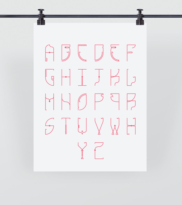


These are images of Caitlin scuba diving, a hobby she hadn't mentioned but I find fascinating. I think this would inspire and influence a very unique typeface. I am going to look into different aspects of diving and explore how they can be used to create typography.


Studio Brief 1 - Visual Thinking - Alphabet Soup
| Brief |
|
Produce
a set, series or sequence of ten letterforms that explore and
communicate your interpretation of the word that you have selected from
the randomisers. Using your newfound appreciation of the anatomy of typographic forms and the wealth of research that you have already gathered, focus on the manipulation of existing letterforms in order to solve this problem. |
| Background / Considerations |
|
Think
visually. Consider what the visual essence of your subject matter is
and how best to communicate this. What are the obvious responses? How
can you beyond these? How subtle can you be? Do your ideas operate as a
set, series or sequence? The following terms may prove useful: Trace, erase, layer, combine, outline, silhouette, and surface. Consider the most effective and controlled use of media appropriate to your subject matter. EXPERIMENT with a range of possible line qualities, marks, colour and paper types. How will colour help with the communication? What paper stocks can you work with? Do you need to draw, photocopy, photograph, collage, trace or combine all of these processes? |
To start this project off, I looked into the various meanings of the word 'compact'. Through looking at these, as well as some synonyms, I was able to generate some ideas and get a stronger starting point.
com·pact
adjective
1.
joined or packed
together; closely and firmly united; dense; solid: compact soil.
2.
arranged
within a relatively
small space: a compact shopping center;
a compact kitchen.
3.
designed
to be small in size and
economical in operation.
4.
solidly or firmly
built: the compact
body of a lightweight wrestler.
5.
expressed concisely; pithy; terse;
not diffuse: a compact review of the week's
news.
verb
(used with object)
8.
to
join or pack closely together; consolidate; condense.
9.
to make
firm or stable.
10.
to form or make
by close union or conjunction; make up or compose.
11.
Metallurgy
. to compress (metallic or metallic and nonmetallic powders) in
a die to be sintered.
12.
to crush into compact
form for convenient disposal or
for storage until disposal: to compact rubbish.
noun
13.
a small
case containing a mirror, face powder, a
puff, and sometimes rouge.
14.
Also
called compact car . an automobile that is
smaller than an intermediate but larger than
a subcompact and generally
has a combined passenger
and luggage volume of 100–110 cu. ft. (2.8–3.1 m 3
).
15.
Metallurgy . (in
powder metallurgy)
an object to be sintered
formed of metallic or of metallic and
nonmetallic powders compressed in a die.
Origin:
1375–1425; late Middle English < Latin compāctus (past participle of compingere to shut away, bind together), equivalent to com- com- + pag-, variant stem of pangere to fix, arrange (akin to pāx peace; compare pact, compact 2 ) + -tus past participle suffix
1375–1425; late Middle English < Latin compāctus (past participle of compingere to shut away, bind together), equivalent to com- com- + pag-, variant stem of pangere to fix, arrange (akin to pāx peace; compare pact, compact 2 ) + -tus past participle suffix
Synonyms
2. small, snug. 5. concise, succinct, brief. 8. compress. 9. stabilize, solidify.
2. small, snug. 5. concise, succinct, brief. 8. compress. 9. stabilize, solidify.
Main Entry:
compact
Part of Speech: verb
Definition: make condensed Synonyms: combine,
compress,
concentrate,
condense,
consolidate,
contract, cram,
integrate,
pack,
set,
solidify,
stuff,
unify,
unite
Part
of Speech: adjective Definition: condensed Synonyms:
appressed, bunched,
close,
compressed, crowded,
dense,
firm,
hard,
impenetrable,
impermeable, packed,
pressed, solid,
thick,
tight
My initial ideas for this project are:
- 10x10 squares filled with the letter, as though it has been crammed in
- Larger stroke to gap ratio
- Solidify or firmly built - scaffolding or something 'holding' the letter up?
- Parts of the letter are holding up other parts of the letter
- Letter seems to have been crushed and are caving in
- Squeeze letters into various shapes
- Cut parts from numerous letters and use to form one letter
- Impenetrable?
Folding letters in on themselves
These are images I got from googling 'Compact', as well as scaffolding as reference for an intial idea:


OUGD 401 - Study Task 1
Love

Hate
These are taken from the vast collection of ‘Keep Calm' posters. They are very simple and only really use white text on a block coloured background. The message within the designs, due to its easily reproducible appearance, can vary greatly and usually have no real purpose or meaning, making the whole design pointless. I think due to its recent popularity there have been so many of these types of posters floating around which is why I now strongly dislike them. I feel that they now take no real design skill to produce as they are all straight forward copies of previous examples.


This is a piece of design that I find very interesting and
aesthetically pleasing. I think this is due to the simple geometric shapes used
and the repetition within the design helps to enforce the ideas portrayed. The
design has almost been cut into three narrow strips with all the strips being
identical, keeping the image very simple and very bold. It is fairly monochrome
with a slight section of red which really draws in the audience. The text,
which says ‘Wu Lyf’, is the name of the band and designers of this piece of
artwork. I like how although it has also been repeated three times within the
design, you can still only see one whole version of the type as the other two
have been cut from the edges. The reason
that I enjoy this design so much is mainly due to how well it communicates the
band and their views and opinions. Although this work has a very niche audience,
I think it is still extremely recognisable as a piece of their work to those
who are familiar with it.
Hate
These are taken from the vast collection of ‘Keep Calm' posters. They are very simple and only really use white text on a block coloured background. The message within the designs, due to its easily reproducible appearance, can vary greatly and usually have no real purpose or meaning, making the whole design pointless. I think due to its recent popularity there have been so many of these types of posters floating around which is why I now strongly dislike them. I feel that they now take no real design skill to produce as they are all straight forward copies of previous examples.


Subscribe to:
Comments (Atom)