- Font and Typeface - This is the Wikipedia definition of typeface and font:
Every typeface is a collection of glyphs, each of which represents an individual letter, number, punctuation mark, or other symbol. The same glyph may be used for characters from different scripts, e.g. Roman uppercase A looks the same as Cyrillic uppercase А and Greek uppercase alpha. There are typefaces tailored for special applications, such as map-making or astrology and mathematics. The term typeface is frequently confused with the term 'font'. Before the advent of digital typography and desktop publishing, the two terms had more clearly understood meanings.
Font nowadays is frequently used synonymously with the term "typeface", although before the advent of digital typography and desktop publishing, "font" referred to a single size and "typeface" referred to a set of otherwise identical fonts of different sizes. Beginning in the 1980s, with the introduction of computer fonts, a broader definition for the term "font" evolved. Different sizes of a single style—separate fonts in metal type—are now generated from a single computer font, because vector shapes can be scaled freely. "Bulmer", the typeface, may include the fonts "Bulmer roman", "Bulmer italic", "Bulmer bold" and "Bulmer extended", but there is no separate font for "9-point Bulmer italic" as opposed to "10-point Bulmer italic".
A font, not to be confused with typeface, is a specific weight or style
within a certain typeface. For example the typeface Bulmer may include
the fonts Bulmer Roman, Bulmer Italic, Bulmer Bold and Bulmer Extended.
Before digital printing, different point sizes would be made from
different fonts. For example, 9-point Bulmer italic would be a
completely different font from 10-point Bulmer italic; the process
involved before digital printing meant that this had to be the case.
Digital printing has meant that the size of the font used can easily be
changed, thanks to the ease at which vectors can be scaled and changed.
Techniques such as letterpress were the main forms of printing and font
referred to the complete set of metal characters that were used to print
an entire page. As the glyphs were metal objects it meant that in order
for the letter to be bigger or smaller, another new metal piece would
have to be made.
A typeface, or a font family, is a set of characters that share very
similar visual qualities. Every typeface contains a collection of
glyphs, each of which represents an individual letter, number,
punctuation mark, or other symbol. A single typeface is represented by
very specific features such as weights, style slant etc. but not by
size. For example, ITC Helvetica Neue Condensed Bold Italic is a
different typeface from ITC Helvetica Neue Condensed Regular Italic.
However, they do both belong to the typeface family Helvetica Neue.
There are thousands of typefaces already, with many more being created
constantly.
As you can see from the image below, the most commonly used glyphs such
as a and o are placed more central within the drawer to allow for easier
access. The less frequently used glyphs such as b, l and v are placed
further out from the middle. When letterpress was used as the main form
of printing, people would have been paid for the speed at which they
could print. This lay-out would have meant that they could complete this
process as efficiently as possible.
Knowing the difference between font and typeface in the current graphic design industry is very important.
- Readability and Legibility -
Readability refers to aspects such as the language used within a sentence and the ease at which this can be read. For example, the way in which people converse when using text messages is greatly different to the way in which people actually write and spell things.
'Readability can be defined not on a letter by letter basis, but how the combination of letters are read within a larger body of text. In other words, readability is defined by the amount of effort one needs to make to read text, not single characters.'
Legibility focuses on how legible the actual letterforms are and how clearly and effectively they represent the certain glyph. There are many ways in which the letter 'A' could be interpreted and shown but some representations would be much clearer and easier to recognise than others.
'Legibility can be defined as the ability a human reader to read something without effort. It can depend on many things. Often, the size of font chosen restricts legibility. For our purposes though, legibility is discussed in light of typeface choice.'

'Legibility can be defined as the ability a human reader to read something without effort. It can depend on many things. Often, the size of font chosen restricts legibility. For our purposes though, legibility is discussed in light of typeface choice.'
'The above text is exactly the same in both cases, yet if one tries to
read it, one finds some differences.The one on the left is a serif font
(Times New Roman), while the one on the right is sans-serif
(Helvetica). When reaching the end of each line, from my experience at
least, it is easier to identify the correct next line in the text on the
left. The one on the right creates some problems to read the line, even
though letters are easier to understand. On the left we have what is
called readable type, while on the right we have a legible type.'
'Sans-serif typefaces are more legible and therefore easier for spot
reading, while serif typefaces are more readable and easier to read when
one has long texts.'
- Kerning and Tracking -
Tracking is the overall letter spacing; the adjustment of space for groups of letters or entire paragraphs. It can have a huge impact on the overall appearance and readability of text if not applied correctly. Just like kerning, tracking is a vital aspect of graphic design, as it could possibly ruin an otherwise good piece of design. If not applied properly, it could be hard to distinguish where one paragraph ends and another beings or perhaps numerous lines of texts become slightly overlaid and therefore distorted and hard to read. At the end of the day, if the text is unreadable then it doesn't matter how good the content is as it won't be able to be read.
This is a kerning game that teaches the user what kerning is and how to effectively apply it. It can be found at 'http://type.method.ac/'. It is very useful in teaching the basics of kerning as well as giving the user practice and knowledge of how different types of lettering look when kerned properly.


- Lay-Out and Grid -
'Page layout is the part of graphic design that deals in the arrangement and style treatment of elements on a page.' There are no hard and fast rules in how this is applied to graphic design; much of this application is based on personal aesthetic preferences. If the designer thinks that something looks good a certain way then that is up to them, but it does not necessarily mean that everyone will think the same. This explains why there are so many different examples of design that has been clearly considered and laid out accordingly.
'A typographic grid is a two-dimensional structure made up of a series of intersecting vertical and horizontal axes used to structure content. The grid serves as an armature on which a designer can organize text and images in a rational, easy to absorb manner.' The use and application of the grid is the tool that the designer uses in aid in the reading or viewing of the content on a page. It could make the viewer look at something in a certain order or perhaps just make the page much easier to take in. Once again, this is very much down to the designers aesthetic opinions.
- CMYK and RGB -
CMYK contains the colours cyan, magenta, yellow and black (or key). 'The CMYK model works by partially or entirely masking colours on a lighter, usually white, background. The ink reduces the light that would otherwise be reflected. Such a model is called subtractive because inks "subtract" brightness from white.' The way in which this works is when these four colours are overlaid at varying amounts you get different colours; the idea being that you can achieve every colour from the CMYK colour selection just by changing the percentages of each colour. When it comes to printing, normally, you would be charged per printing plate. This means that if you were to print black onto white paper, you would only need to use one plate. However, if you had even 1% of another colour within that design, which your eye wouldn't even be able to tell, you would need to pay for a whole other plate. This can be very costly and is something that the designer needs to ensure is correct before any printing is done.
RGB contains of the colours red, green and blue. 'In additive color models such as RGB, white is the "additive" combination of all primary coloured lights, while black is the absence of light. In the CMYK model, it is the opposite: white is the natural colour of the paper or other background, while black results from a full combination of colored inks.' This colour mode is used for screen and the colours within this range differ slightly from those of the CMYK range.
- Rods and Cones -
Information taken from http://faculty.washington.edu/chudler/retina.html:
'The cones are not as sensitive to light as the rods. However, cones are most sensitive to one of three different colors (green, red or blue). Signals from the cones are sent to the brain which then translates these messages into the perception of colour.' There are about 6 million cones in the human retina. Colour blindness occurs when a person is missing a certain type of cone, or perhaps a type of cone is slightly weaker; this results in the eye lacking distinction between certain colours.
One part of the retina however does not contain any of these photoreceptors. This is our 'blind spot' and anything that falls within this area will be completely invisible to our eyes.
To find your blind spot, look at the image below:
Close your left eye.
Hold the image about 20 inches away. With your right eye, look at the dot. Slowly bring the image closer while looking at the dot. At a certain distance, the + will disappear from sight...this is when the + falls on the blind spot of your retina. Reverse the process. Close your right eye and look at the + with your left eye. Move the image slowly closer to you and the dot should disappear.
- The Anatomy of Type -

This website, 'Typography Deconstructed' was very useful for this section of my publication and is where I gathered much of my information from.

An imaginary line drawn from top to bottom of a glyph bisecting the upper and lower strokes is the axis.

A horizontal or upward, sloping stroke that does not connect to a stroke or stem on one or both ends.

A point at the top of a character where two strokes meet.

The fully closed, rounded part of a letter.

The open space in a fully or partly closed area within a letter.

A small stroke extending from the upper-right side of the bowl of lowercase g; also appears in the angled or curved lowercase r.

The part of the letters that extends below the baseline.
- Semiotics -
Semiotics is usually divided into three parts:
- Semantics - what was the meaning of the words or signs used;
- Pragmatics - who said it, to whom and in what circumstances and
- Syntactics - the formal rules of the language used.
For example, the Apple logo:

Pretty much everyone knows what this iconic logo is for; the company Apple. However, in terms of semiotics it represents three separate things. It is a sign, symbol and signifier. For example:
It is a sign an Apple.
It is a symbol for the computer company 'Apple'
It signifies quality, innovation, creativity etc.
- The Pantone Colour Guide -
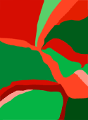
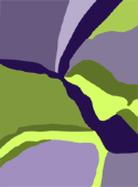
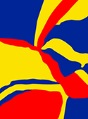
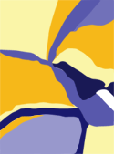
- The Seven Laws of Colour -
Information taken from http://www.worqx.com/color/itten.htm:
THE CONTRAST OF SATURATION
 The contrast is formed by the juxtaposition of light and dark values and their relative saturation.
THE CONTRAST OF LIGHT AND DARK
 The contrast is formed by the juxtaposition of light and dark values. This could be a monochromatic composition.
THE CONTRAST OF EXTENSION
 Also known as the Contrast of Proportion. The contrast is formed by assigning proportional field sizes in relation to the visual weight of a color.
THE CONTRAST OF COMPLEMENTS
 The contrast is formed by the juxtaposition of color wheel or perceptual opposites.
SIMULTANEOUS CONTRAST
 The contrast is formed when the boundaries between colors perceptually vibrate. Some interesting illusions are accomplished with this contrast.
THE CONTRAST OF HUE
 The contrast is formed by the juxtaposition of different hues. The greater the distance between hues on a color wheel, the greater the contrast.
THE CONTRAST OF HUE - PRIMARIES
 The contrast is formed by the juxtaposition of primary hues.
THE CONTRAST OF WARM AND COOL
 The contrast is formed by the juxtaposition of hues considered 'warm' or 'cool.'
However, despite the placement of these colours laws as a guide to all, the selection of colour is still completely dependant on the aesthetics views and opinions of the design. In the end, everyone has different perceptions of good design and so there is no correct answer. Unfortunately.
No comments:
Post a Comment