Systematic Colour - Part 1
Introduction to colour principles
Introduction to colour principles


- The eye contains two kinds of receptors: rods and cones.
- While the rods convey shades of gray, the cones allow the brain to perceive colours.
- Of the three types of cones, the first is sensitive to red-orange light, the second to green light and the third to blue-violet light.
When a single cone is stimulated, the brain
perceives the corresponding colour.
- If our green cones are stimulated, we see "green".
- If our red-orange cones are stimulated, we see "red".
- If both our green and red-orange cones are simultaneously stimulated, our perception is yellow.

Primary colours - Red, Yellow and Blue. Cannot be made by mixing any other colours
Secondary colours - Orange, Green and Violet. Made from mixing two primary colours together.
Tertiary colours - Can be made from mixing a primary with an associated secondary colour.

Different sets of primary colours for digital and print.
RGB - Digital, on screen
CMYK - Print

 |
| Subtractive colour |
 |
| Additive colour |
- CMYK produces RGB as secondary colours
- RGB produces CMYK as secondary colours


Studio Task 1 - We were then given a task to collect a set of items all relating to a certain colour. As a group, we put all of our items together and created a colour wheel from them.


Systematic Colour - Part 2
Chromatic value = hue + tone + saturation
The hue is the chromatic value but we have to consider tone and saturation too.
Hue
Chromatic value = hue + tone + saturation
The hue is the chromatic value but we have to consider tone and saturation too.
Hue
 |
| Different hues |
 |
| Different colours, same hue |
 |
| Adding white to a pure hue |
 |
| Adding black to a pure hue |
 |
| Adding grey to a pure hue |

Saturation refers to the dominance of hue in the colour.


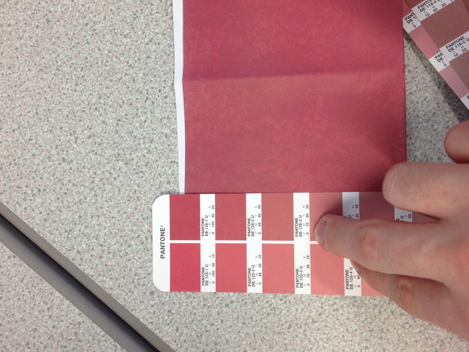
Pantone is your best friend
Studio Task 2 - We then, as a pair, had to select a series of items from our colour and match their colours with the pantone selection.

Pantone DE97-2U

1807C

208M

DE126-2U
1815C

DE112-1C

DE98-1C
Colour & Contrast - Part 3
The
eye contains two kinds of receptors - rods and cones.
Rods - shades of grey
Cones - colour hues.
three
types of cones -
- sensitive to red-orange light
- green light
- blue-violet light.
The eye can be "fooled" into seeing the full range of visible colours
through the proportionate adjustment of just three colours: red, green
and blue. Our eyes are fooling the brain into seeing all the different
colours.
Itten's 7 contrasts

 Even without colour you can see the difference based on tone.
Highest contrast we can see is black and white. Greys - mid tones.


Blue, Yellow and Red all have equal contrast of hue.
 Blue stands out the most because the blue
has the highest contrast.
Blue stands out the most because the blue
has the highest contrast.
However on a black background the blue is closest tonally, meaning the yellow has the highest contrast.


Fundamental contrasts - Tone, hue and saturation.


Warm colours - associated with heat. Red, orange, yellow.
Cool colours - associated with ice. Blue, purple.


- Contrast of tone

Blue- Darkest contrast
Red- Mid tone
Yellow- Lightest contrast

Highest contrast we can see is black and white. Greys - mid tones.

Black and white text are both as easy to read on the mid-tone background. But when another mid-tone is used, it is a lot harder to read.


- Contrast of hue
Blue, Yellow and Red all have equal contrast of hue.

However on a black background the blue is closest tonally, meaning the yellow has the highest contrast.

When placed
together, you can clearly see a separation in between the blue and
yellow as there is a high contrast present. But if you look at the
yellow and red line for too long, they start to merge as they are closer
tonal values.


- Contrast of saturation
Fundamental contrasts - Tone, hue and saturation.

- Contrast of extension


- Contrast of temperature
Warm colours - associated with heat. Red, orange, yellow.
Cool colours - associated with ice. Blue, purple.

With the black
lines above the colours look flat. However when they are removed the eye
is tricked into seeing a gradient, even though this is not present.
This is due to the contrast from the colour next to it.

- Complementary contrast


The red and green have just as high contrast as the black and white.
 |
- Simultaneous contrast

This image makes it seem as though the lines are vibrating and merging together as all of the contrast is happening simultaneously.
Subjective colour - Part 4

This top image is quite easy to read as there is a strong contrast between the yellow and violet because they are complementary colours. However, when this is reversed it become much harder to read. This is because the yellow is much brighter and stands out more than the violet, forcing you to see the yellow counters before the violet letterforms.


It appears as though the two squares are different colours, however this is just a trick and the line going through the middle of the image shows that they are in fact the same colour.

The 'bold' on the green background looks to have a slight violet tint. This is because colours
always want their complementary colours, thus the green is trying to throw out some red
resulting in a violet tint.
No comments:
Post a Comment